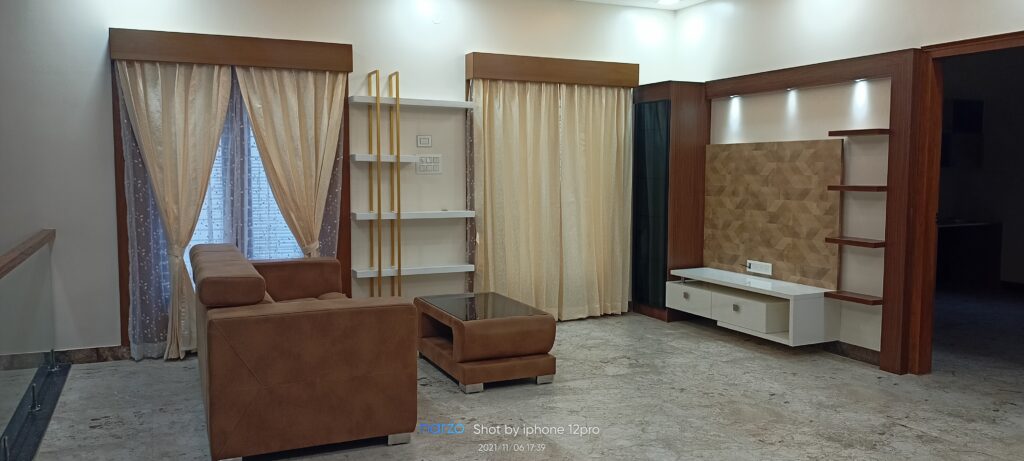
In the realm of design, colour holds immense power. It can convey messages, evoke emotions, and create visual harmony. Whether you’re designing a website, branding materials, or interior spaces, selecting the right colour palette is crucial for achieving a cohesive and impactful look. Grandeur Elite is a leading interior designing company in Rajarajeshwari Nagar that can help you create a stunning interior. In this blog post, we’ll explore the art of creating harmonious colour palettes and provide practical tips for incorporating them into your design projects.
Understanding Colour Theory
Before diving into the process of creating colour palettes, it’s essential to have a basic understanding of colour theory. Colour theory means exploring how colours interact with one another and how they can be harmoniously combined to create visually appealing compositions. The colour wheel, a fundamental tool in colour theory, consists of primary colours (red, blue, and yellow), secondary colours (orange, green, and purple), and tertiary colours (mixtures of primary and secondary colours).
Tips for Creating Cohesive Colour Palettes
Let’s explore some practical tips for creating cohesive colour palettes:
Start with a Base Colour
When creating a colour palette, it’s helpful to begin with a base colour that sets the tone for your design. This base colour will serve as the foundation upon which the rest of the palette is built. Choose a colour that aligns with the mood and aesthetic you want to convey. For example, if you’re aiming for a calming and serene vibe, you might opt for soft blues or greens. If you want to create a bold and energetic look, vibrant reds or oranges could be more appropriate.
Explore Colour Harmonies
Colour harmonies refer to combinations of colours that work well together and create a sense of balance and cohesion. Some common colour harmonies include:
- Analogous: These colours are hues positioned adjacent to one another on the colour wheel, such as blue, blue-green, and green.
- Complementary: Colours that are opposite each other on the colour wheel, such as green and red or orange and blue.
- Triadic: Three colours that are evenly spaced around the colour wheel, such as red, yellow, and blue.
- Split-complementary: A variation of the complementary scheme, where one base colour is combined with the two colours adjacent to its complementary colour.
Experiment with different colour harmonies to find combinations that resonate with your design vision. Keep in mind that harmonious colour palettes typically include a mix of hues, tints, and shades to add depth and interest.
Consider Contrast and Balance:
While harmony is essential, contrast adds visual interest and helps elements stand out. Incorporate contrasting colours sparingly to highlight key elements or add emphasis. Balance bold colours with neutral tones to maintain equilibrium and prevent your palette from feeling too chaotic.
Consider Colour Psychology
Colour psychology explores the impact of colours on human emotions and behaviour. For instance, blue symbolises calmness and trust, while yellow symbolises optimism and energy. Consider the psychological effects of colour when selecting hues for your palette and how they align with the message or mood you want to convey.
Balance Warm and Cool Tones
Another important aspect of creating cohesive colour palettes is balancing warm and cool tones. Warm colours, such as reds, oranges, and yellows, evoke feelings of warmth, energy, and passion. Cool colours, such as blues, greens, and purples, evoke feelings of calmness, tranquillity, and serenity. Incorporating a mix of warm and cool tones can create visual interest and balance in your design. Experiment with different combinations to find the right balance for your project.
Test and Refine
Once you’ve selected your colour palette, it’s essential to test it in different contexts and environments to ensure its effectiveness. Consider how the colours look on various devices and screens, as well as how they interact with different lighting conditions. Make adjustments as needed to ensure that your palette remains cohesive and impactful across all platforms.
Seek Inspiration
Draw inspiration from sources such as nature, art, fashion, and photography to discover unique colour combinations and unexpected pairings. Experiment with unconventional hues and explore the emotional impact of different colour choices to create memorable and impactful designs. As an interior design studio in Rajarajeshwari Nagar, Grandeur Elite’s professional designer can help you with great ideas and inspiration to achieve a cohesive decor.
Summary
Creating cohesive colour palettes is a fundamental aspect of effective design. By understanding colour theory, exploring colour harmonies, considering colour psychology, balancing warm and cool tones, and testing and refining your palate, you can create visually compelling designs that resonate with your audience. As a popular interior design company in RR Nagar, Grandeur Elite’s skilled designers can help you create spaces that suit your style and personality. Whether you’re designing a website, branding materials, or interior spaces, harnessing the power of colour is key to creating memorable and impactful experiences. Contact us today to get more inspiration.
